|
Hi app founders, designers, and marketers. |
Second week of sharing one quick design tip with you every Thursday. |
Today's tip is about onboarding questionnaires, and how just a tiny visual change can turn your boring form into something that users will actually complete. |
It comes from our analysis of Sketchar, an AR drawing app currently doing $30K MRR. |
The questionnaire problem |
Most apps open with a questionnaire that looks something like this: |
|
By the third question, half your users have already zoned out. Research consistently shows that 72% of users abandon apps during onboarding if it requires too many steps. |
|
What Sketchar does differently |
Instead of asking "what do you want to draw?" and leaving it at that, Sketchar fills the entire screen with colored category tiles, each one already showing a drawing. |
Nature, people, architecture, food. Every option is visual before it is verbal. |
That one change shows the product's capability before the user has even started, and turns a data-collection step into something that feels like discovery. The question is the same, but the experience feels completely different. |
|
How Headspace used the same logic to lift conversions by 10% |
Headspace, the $2M MRR meditation app, ran experiments on their onboarding flow and found that allowing users to express multiple needs resulted in a nearly 10% increase in conversion rate. |
Their onboarding asks about stress, goals, and experience level, but each question is anchored in what the user is feeling right now, not what they abstractly hope to get from an app someday. |
The pattern is the same across both apps. Surface the problem the user already feels, then immediately show how your product answers it, and do it visually wherever you can. |
|
So, here you have it. |
Replace abstract onboarding questions with visual, problem-first screens. Show users what the answer looks like before asking them to choose it. |
Would you test it on your app? Reply and let us know, we read every email. |
Watch the full Sketchar breakdown: |
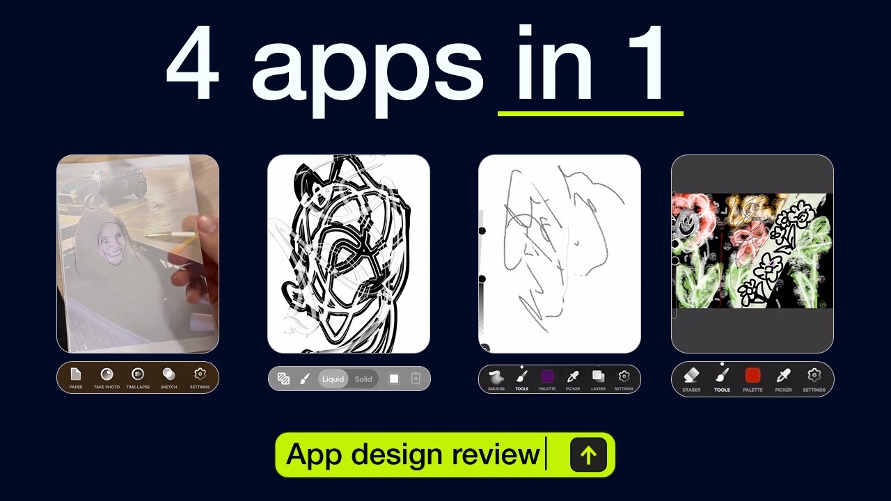 | The Design Flow Behind a 12 Million Downloads App | App Breakdown #74 |
|
|
See you next week, |
The App Store Tracker Team |
|




