|
Hi app founders, designers, and marketers. |
Last week we looked at how to improve onboarding questionnaires. |
This week we're looking at what happens once the questions begin, and how small interaction details can make onboarding feel almost effortless for the user. |
It comes from our analysis of FocusFlight, a deep-focus timer app that generated $60K MRR over 100K downloads last month. |
|
Onboarding that feels like gameplay |
At its core, the onboarding is very simple. It asks one question at a time, with a single obvious button to press, but each screen adds just enough animation and movement to keep things interesting. Text shakes, words change color, buttons animate, and every tap feels like real progress instead of another step in a form. |
|
Make each step feel new |
One of the best examples is the "Choose Your Focus Scenario" screen. Instead of static buttons, the answers fall into place like Tetris pieces and continue moving across the screen. Tilt your phone and they move with it, following gravity. |
|
Another screen lets you tear your boarding pass by dragging it across the display. Neither interaction is necessary, but together they stop the onboarding from feeling repetitive. |
|
The skip button that saves the session |
Even playful onboarding has a limit. During that ticket-tearing screen, if you wait too long without completing the action, a skip button slowly appears. |
If a user gets stuck, give them an easy way out before frustration sets in. A long onboarding video that cannot be skipped will just get triple-tapped until the user finds the exit themselves. |
Fun interactions keep engaged users moving forward, while a skip option catches everyone else before frustration turns into an uninstall. |
|
So, here you have it. |
Great onboarding doesn't rely on one trick. It keeps users moving with simple interactions, surprises them often enough to stay interesting, and always gives them an easy way out if something doesn't click. |
Would you test it on your app? Reply and let us know, we read every email. |
Watch the full FocusFlight breakdown: |
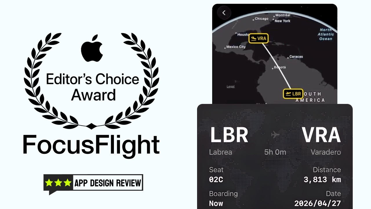 | FocusFlight: A Masterclass on Onboarding & Awareness Design | App Breakdown #75 |
|
|
See you next week, |
The App Store Tracker Team |
|




